What do you need to start color grading professionally?
A professional color workflow depends on accurate monitoring, color management, scopes, capable hardware, and disciplined decision-making.
The essential tools, skills, and workflow behind a reliable color suite
Color grading is often presented as the final creative polish that makes footage look cinematic. That description is only partly true.
A professional colorist is responsible for consistency, technical accuracy, visual focus, emotional tone, and reliable delivery across different screens.
The work involves creative taste, but it also requires a controlled process. A beautiful grade is not useful if it changes dramatically on every display or falls apart during export.
You do not need a massive post-production suite to begin. You do need to understand which investments affect the image and which ones mostly make the room look impressive.
Begin with color grading software you can grow into
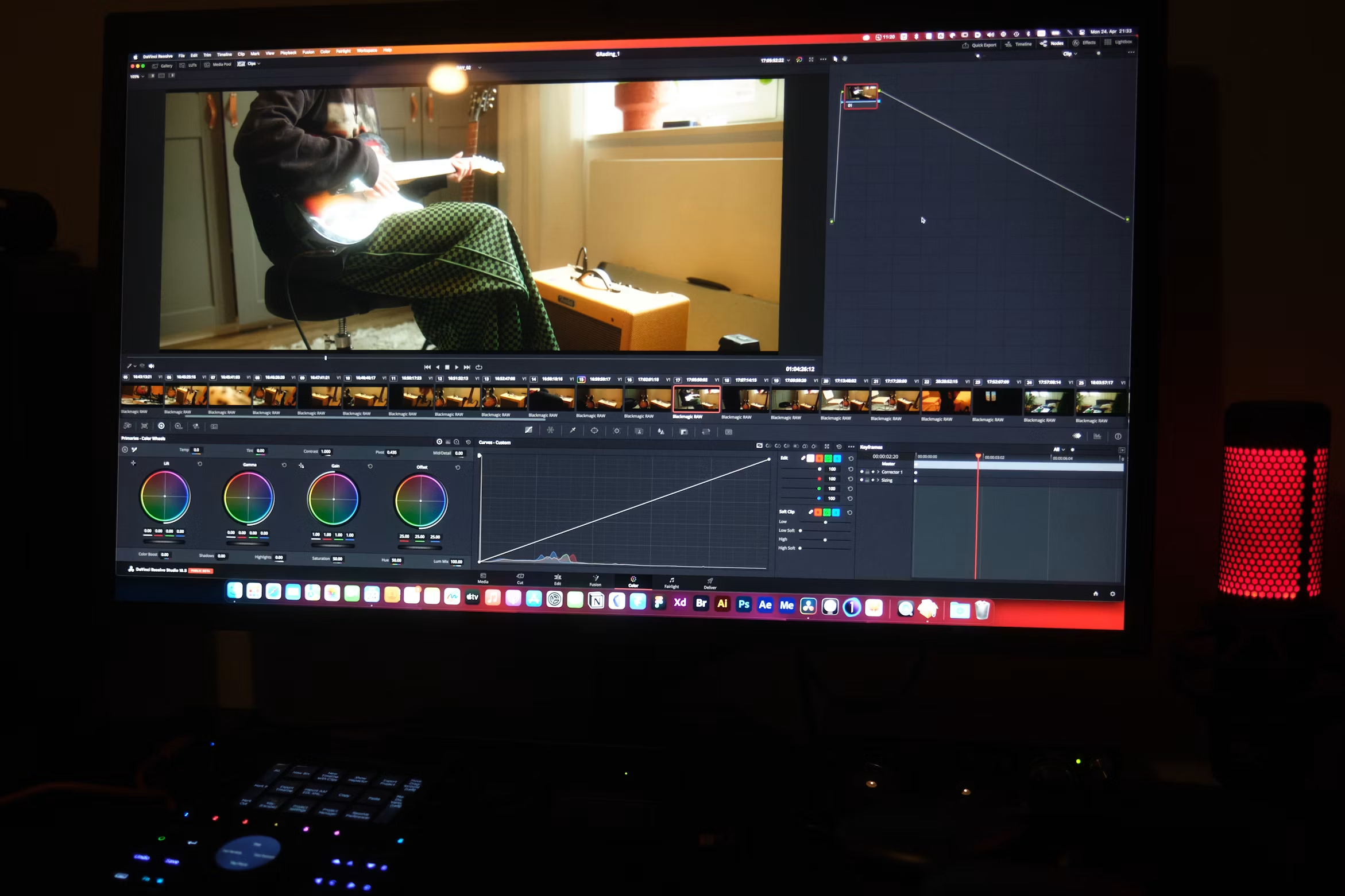
DaVinci Resolve remains a strong starting point because editing, color, visual effects, and audio tools can live within one project. Its color page includes scopes, node-based grading, tracking, masks, color management, and delivery controls.
Other professional applications can also produce excellent results. The software matters less than your ability to build a repeatable workflow.
Choose one primary system and learn it deeply before collecting plugins.
Start with the fundamentals:
- Exposure and contrast
- White balance
- Shot matching
- Saturation
- Skin tone evaluation
- Curves and primary controls
- Secondary corrections
- Tracking and windows
- Noise reduction
- Color space transforms
- Export and quality control
LUTs can be useful for transforms or creative direction, but they should not replace understanding.
Use a monitor you can trust
Your display is the foundation of the room. A large, bright consumer television may look impressive while showing you an inaccurate version of the image.
Look for a monitor with good uniformity, stable viewing angles, sufficient bit depth, and support for the color space you plan to deliver.
A true reference monitor is ideal, but beginners can start with a quality display that can be calibrated properly.
Calibration is not a one-time event. Displays shift over time. A measurement device and calibration software help you create a known baseline rather than grading by memory.
Brightness also matters. A monitor set far brighter than the viewing standard may cause you to create grades that look too dark elsewhere.
Control the grading environment
Even a calibrated monitor can mislead you in a room filled with colored light.
Keep the area around the display neutral. Avoid bright artwork, saturated LED lighting, and sunlight changing throughout the session.
Use consistent bias lighting behind the monitor when appropriate. Neutral walls and controlled ambient light help your eyes adapt to the image rather than the room.
You do not need to build a black cave. You need an environment that remains predictable.
Learn color management before chasing a look
Modern cameras record footage in different log curves, gamuts, and codecs. If you do not know how the material should enter and leave your grading system, creative adjustments become guesswork.
A color-managed workflow tells the software what the source footage is, what working space you want to use, and what output you need to deliver.
DaVinci Resolve Color Management and ACES are two common approaches.
The exact choice depends on the project. The important skill is understanding input, timeline, and output transforms. You should know whether a LUT is being used as a technical conversion, a creative look, or both.
This becomes especially important when one timeline contains footage from several camera systems.
Build a computer around the footage you grade
Color grading can place heavy demands on the graphics processor, memory, storage, and video decoding hardware.
Noise reduction, temporal effects, high-resolution raw media, and complex node trees can slow down a weak system.
Choose hardware based on the projects you expect to handle, not the most extreme camera format on the market. A capable GPU, enough system memory, fast project storage, and reliable backup drives matter more than decorative accessories.
Use proxies or optimized media when needed. Professionalism is not measured by whether you force the original files to play poorly. It is measured by whether you create an efficient workflow without compromising the final output.
Use scopes instead of trusting your eyes alone
Your eyes adapt quickly. After staring at a warm image, a neutral image may appear cool. Scopes provide an objective reference.
Learn to read the waveform for exposure, the parade for channel balance, the vectorscope for saturation and hue, and clipping indicators for signal limits.
Scopes do not make creative decisions for you. They reveal information your eyes may overlook.
Skin tone should also be judged with context. There is no single value that represents every person, lighting condition, or creative intention. Use scopes as guidance, then evaluate whether the image respects the subject and the scene.
Separate correction, matching, and look development
Trying to solve everything in one node or one layer makes revisions harder.
A practical order is:
- Normalize or color-manage the footage.
- Correct exposure and white balance.
- Match shots within the scene.
- Shape contrast and color for the creative look.
- Refine skin, skies, products, or other key elements.
- Add texture or finishing effects.
- Review the full sequence and output.
This structure makes it easier to identify where a problem began. It also helps when a client wants the look softened without undoing the technical corrections.
Invest in training and practice footage
A control panel can improve speed and feel, but it will not teach taste. Start with a keyboard and mouse if that is what your budget allows.
Add a grading panel when the limitations of your current controls are slowing down real work.
Study professionally shot films, commercials, and documentaries. Pay attention to how contrast directs the eye, how color changes between locations, and how skin remains believable inside stylized worlds.
Grade full scenes rather than isolated hero shots. A professional colorist must carry an idea across changing angles, lenses, exposure levels, and performances.
What can wait?
You can postpone a large control surface, expensive furniture, a client theater, an extensive LUT collection, and a room full of specialized hardware.
You should not postpone backups, monitor calibration, color management, scopes, or learning how to deliver the correct file.
Professional color grading begins when your decisions become intentional and repeatable. The room can grow over time. Your first priority is building a system you understand and an eye that can recognize what the story needs.
.png)
Subscribe to our newsletter
Join our newsletter and receive thoughtful content designed to help you communicate your mission, strengthen your brand, and make a lasting impression.